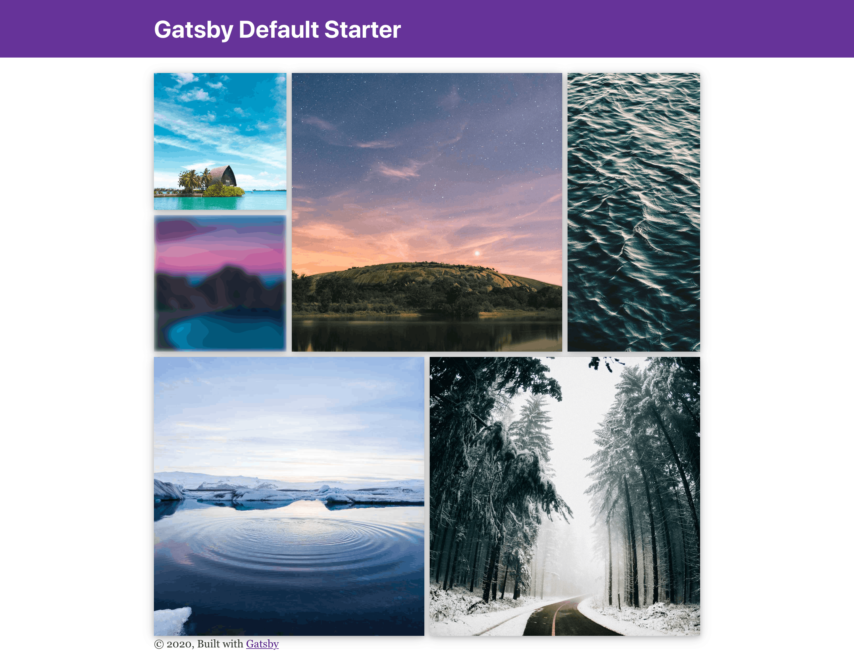
Hey, there!
I have recently built a gallery for my personal website and I'd like to share some of the knowledge I acquired.
In this post we will be developing a Photo Gallery, from adding a directory with pictures and querying them in GraphQL to displaying the images and giving the whole gallery some style. We will use the gatsby-starter-default starter as base, but the approach is valid for all other implementations.
You can check the final result deployed on Netlify here!
If you prefer to read the final code, you can take a look at the starter I made from this post.
Installing
We'll be using the gatsby-starter-default starter. You can get it by running:
npx gatsby new gatsby-starter-default https://github.com/gatsbyjs/gatsby-starter-default
Once the command has finished, you can run the following commands to start the development server:
cd gatsby-starter-default
npm run develop
You should now see the following page in http://localhost:8080:

Now we're ready to start development!
Loading the images into GraphQL
First of all, we need to create a folder to hold our images and fill it with some pictures. I have created a content/gallery folder and downloaded some wallpapers from Unsplash, so that it looks like the structure below. I recommend that you have at least 6 images in the gallery directory, so we can see how a full gallery would look like.
.
├── node_modules
├── src
└── content
    └── gallery
        ├── image1.jpg
        ├── image2.jpg
        └── image3.jpg
Now we need to make them available through GraphQL.
Doing so is easy, since the Gatsby starter we are using already includes the gatsby-source-filesystem plugin, which is responsible for obtaining information (i.e., files and their metadata) from the filesystem and providing it through GraphQL.
On top of that, we need to add the Gatsby plugins for sharp, a image manipulation library focused on the web. These plugins (gatsby-transformer-sharp and gatsby-plugin-sharp) allow us to use gatsby-image, a Gatsby wrapper over the img tag that provides optimized image loading.
Most of these package should already be installed, but in case they are not, you can use the following command to install them:
npm install --save gatsby-transformer-sharp gatsby-plugin-sharp gatsby-image gatsby-source-filesystem
Now, to actually use the tools, we need to add them to the plugins array in gatsby-config.js. Note the special configuration for the gatsby-source-filesystem plugin:
plugins: [
  {
      resolve: `gatsby-source-filesystem`,
      options: {
        name: `gallery`,
        path: `${__dirname}/content/gallery`,
      },
   },
  `gatsby-transformer-sharp`,
  `gatsby-plugin-sharp`,
   // other plugins
]
As you can see, we are setting the path we used at the start of the section to stores the pictures (content/gallery). We are also adding a name property, which will help identify which files come from the gallery and which files don't.
Since we have made changes to gatsby-config.js, we must restart the development server for Gatsby to pick up our new images. Once that is done, we can now access the GraphQL UI that Gatsby has included to verify that the process is working until now. Head to localhost:8000/___graphql.
Here you can query all the data that Gatsby has access to. So let's try to find our pictures!
All files sourced by the gatsby-source-filesystem plugin can be found under the allFile query in the GraphQL query explorer. This query returns a huge structure (you can explore the return types on the left), but in this case, we only want a subset of it. The nodes the query returns represent the files in the filesystem.
From these nodes, we can obtain the information we would get from a normal filesystem such as the file name, extension, absolute path and other metadata (e.g., permissions).
Example query:
query MyQuery {
  allFile {
    nodes {
      relativePath
      sourceInstanceName
      publicURL
    }
  }
}
By running the previous query, you should get something like this:
{
  "data": {
    "allFile": {
      "nodes": [
        {
          "relativePath": "ahmed-sharyaan-bY_ut4EqW64-unsplash.jpg",
          "sourceInstanceName": "gallery",
          "publicURL": "/static/ahmed-sharyaan-bY_ut4EqW64-unsplash-f31294c1edb98b0621a66c4bd107f5b8.jpg"
        },
        {
          "relativePath": "jake-fagan-09cFSDQgl64-unsplash.jpg",
          "sourceInstanceName": "gallery",
          "publicURL": "/static/jake-fagan-09cFSDQgl64-unsplash-ad60179df4c39ce37e6c28cd7e003029.jpg"
        }
      ]
    }
  }
}
As you can see, the sourceInstanceName field is the identifier we set in the gatsby-source-filesystem plugin in gatsby-config.js. This will allow us to filter our gallery images.
So, we now know how to find our images! Let's go on to the next part.
Creating the Gallery
Now that we have the images, it's just a matter of creating the gallery!
First of all, we need to obtain the images from GraphQL. It's pretty similar to the query above, but we'll be leveraging sharp with Gatsby's Img tag to handle progressive loading, image placement, etc.
Img requires a very specific set of data, so it provides several GraphQL Fragments that we can use to select the data it needs.
Merging this with the query above, we get the following:
query {
      allFile(
        filter: { sourceInstanceName: { eq: "gallery" } }
      ) {
        nodes {
          id
          childImageSharp {
            fluid {
              ...GatsbyImageSharpFluid # Spreading the Fragment here to obtain the data `Img` needs
            }
          }
        }
      }
    }
If you're using a recent version of React, you can use this query and create a hook to get all the photos in your gallery:
const useGallery = () => {
  const data = useStaticQuery(graphql`
    query {
      allFile(
        filter: { sourceInstanceName: { eq: "gallery" } }
      ) {
        nodes {
          id
          childImageSharp {
            fluid {
              ...GatsbyImageSharpFluid
            }
          }
        }
      }
    }
  `);

  return data.allFile.nodes.map(node => ({
    ...node.childImageSharp, // Note that we're spreading the childImageSharp object here
    id: node.id,
  }));
};
With the useGallery hook, we can now leverage Gatsby's Img and create a Gallery component:
import Img from "gatsby-image"

const Gallery = () => {
    const images = useGallery()

    return (
        <div>
            {images.map(({ id, fluid }) => (
                <Img key={id} fluid={fluid} />
            ))}
        </div>
    )
}
Now you can update you index.js to include the Gallery component and see your pictures in the main page!

Notice how there is a blur when images are loading: this is one of the amazing features of Gatsby's Img!
Note: if you know the size you want the picture to take at compile time, you should use fixed in the GraphQL query, rather than fluid. See more here.
Styling the Gallery with CSS Grid
Now that we have the images, it's just a matter of styling! If you're not worried about backwards compatibility, CSS Grid is the easiest way to implement this!
Simply add a "gallery" class to your <div> enclosing the Img element:
        <div className="gallery">
            {images.map(({ id, fluid }) => (
                <Img key={id} fluid={fluid} />
            ))}
        </div>
Now, create a gallery.css in the same directory as the Gallery component and import it with import "./gallery.css", and let's get to it!
.gallery {
    display: grid;
    grid-template-columns: repeat(4, 1fr);
    grid-auto-rows: 16vw;
    grid-gap: 0.5em;
  }
Here, we're setting the .gallery to be a grid composed of 4 equal-width columns and any number of rows with its height equal to 16% of the viewport width. We're also adding a gap of 0.5em between each grid element.
.gallery > * {
  box-shadow: 0 2px 8px 0 rgba(0, 0, 0, 0.2), 0 3px 20px 0 rgba(0, 0, 0, 0.19);
}

.gallery > :hover {
 filter: blur(4px);
 transition: all ease 0.5s;
 cursor: pointer;
}
Now, let's add a small shadow below behind each image to give it some depth. Also, to add some feedback to the user, let's create a blur effect when the user hovers over the image. We've also set cursor to be a pointer, so that the picture seems clickable. This is useful if you want to implement, for example, a modal that is opened when the user clicks the image.
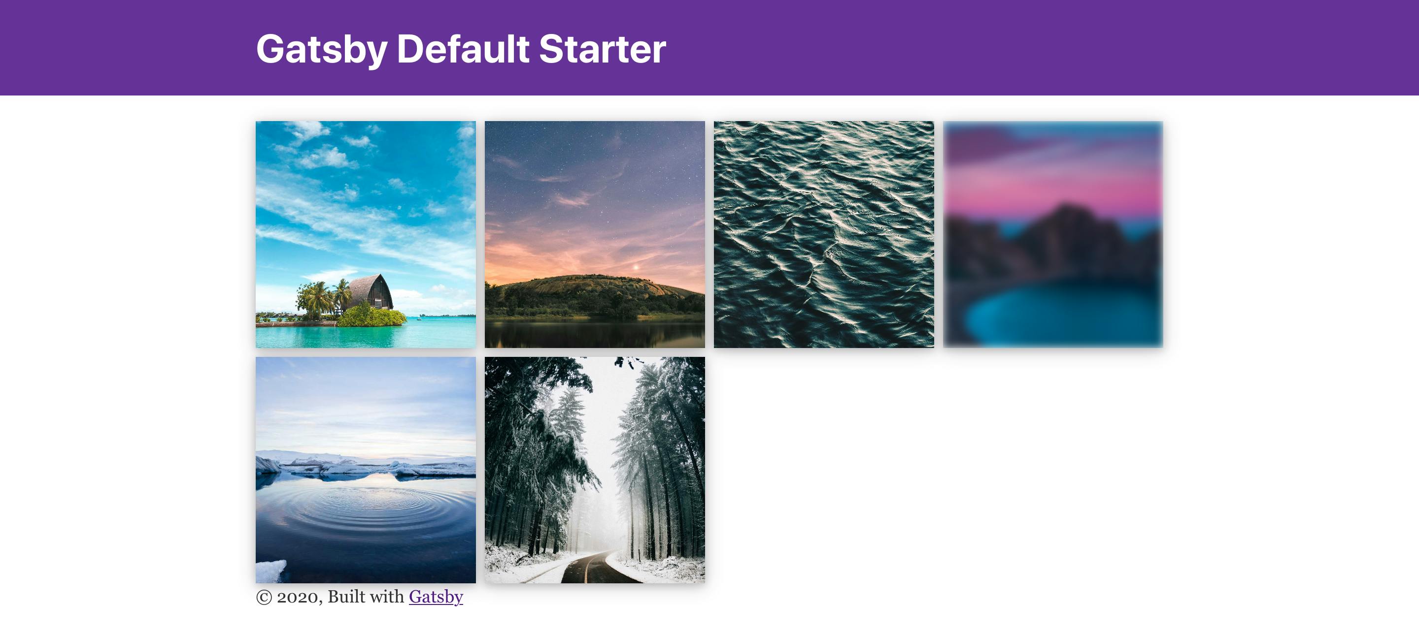
Starting to look good! However, the pictures are still too... organized. Let's add some controlled chaos:
.gallery > :nth-child(6n + 3) {
  grid-column: span 1;
  grid-row: span 2;
}

.gallery > :nth-child(6n + 2),
.gallery > :nth-child(6n + 5),
.gallery > :nth-child(6n + 6) {
  grid-column: span 2;
  grid-row: span 2;
}
We're now setting how many columns or rows each tile spans. This will create a less boring pattern in our gallery!
The end!
Thanks for reading! If you have some questions feel free to ask; and if you liked the post, give it some love and share with your friends.
If you want to know more about what I do, make sure to check my personal website! (Can you recognize the gallery?)
